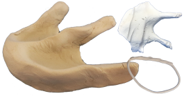
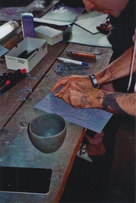
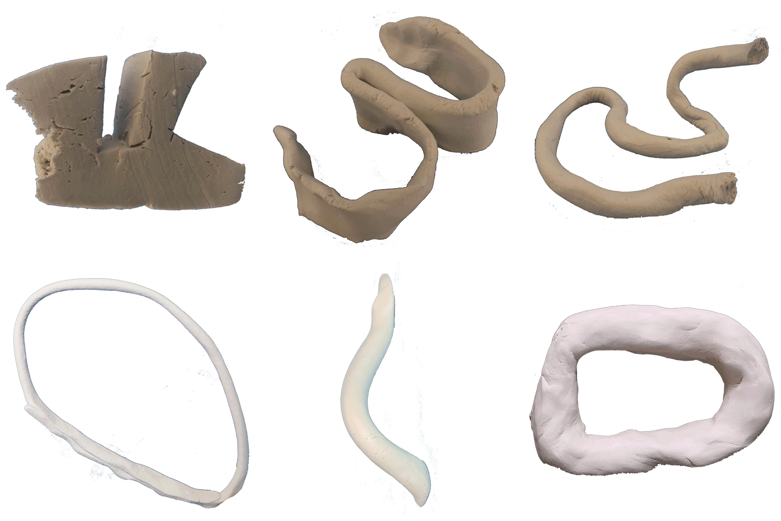
Visual identity for the workshop festival FORMFELD (“shaping space”) organized by Atelier 17111 e.V., in collaboration with Barbara Galizia. The festival's theme “creating space collectively” – linked to that, we approached the project playing with clay.
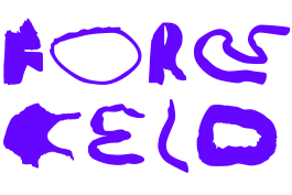
The logo works both in one line and in a compact square transmitting a feeling of handmadeness and fun: Moving and stable, between a shape and a readable letter, an even surface and interesting texture. It integrates core values of the festival – working / creating space together, having fun while learning from each other, acknowledging individual knowledge and skills.
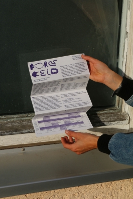
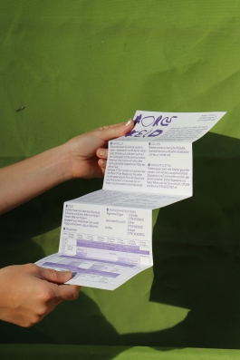
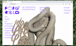
Additionally, we worked on a poster, a website and a festival program. FORMFELD is shown as a place of coming together and realizing ideas / learning / giving and holding space after a year of separation and screen times.
Anna Breit was also creative director of the Festival and moderated the daily group discussions.
Poster
420 × 594 mm
Digital Print
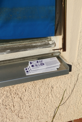
Flyer
210 × 297 mm
Risography
2021